
Brand
Brand Assets
Logo, colors, typography and backgrounds - everything you need to represent Diggama.
Logo
Four tiles, one different.
Four tiles, one different. The rounded tile stands for the piece of content that adapts - define it once, deliver it everywhere. Always keep the distinctive tile in the bottom-right position.



-
✓ Do
Keep clear space around the mark equal to one tile. Use the wordmark in Geist SemiBold, lowercase.
-
✗ Don't
Don't rotate, recolor, or move the rounded tile out of the bottom-right position. Don't stretch or add effects.
-
Minimum size
Mark: 16 px minimum. Full lockup: 24 px height minimum for legibility.
Motion
Built from the four tiles.
Three signature animations for loaders, page transitions and product moments. Subtle, looping, always built from the four tiles.
-
Trace
Each tile draws itself in - loaders & splash screens
-
Assemble
Tiles pop into place - page transitions & reveals
-
Adapt
The distinctive tile morphs - "content that adapts"
Colors
One blue, used sparingly.
Diggama Blue leads, Ink grounds the dark surfaces, and white does the rest: pages are white, framed by thin gray rules. Click any swatch to copy its hex code.
Core
Tints & status
Neutrals
Surfaces
-
Blue aurora
aurora + blue layer, blend: color
-
Dark surface
#030712 · code, terminal, footer
-
Hatching
-45°, 1px every 7px, gray 4.5%
Typography
Geist, and Geist Mono.
Geist for everything people read: headings in SemiBold with tight tracking, body in Regular. Geist Mono for eyebrows, code, figures and labels.
Define your content once
Deliver it everywhere
How it works
Buttons, navigation, labels and badges
The headless CMS for modern teams. Model, manage and ship your content in minutes with a clean REST API, workflows and built-in analytics.
Backgrounds
The aurora, in blue.
The aurora imagery is our signature backdrop behind product screens and bands. Always apply the blue colour layer on top, so the photo keeps its light and texture but takes the brand blue.
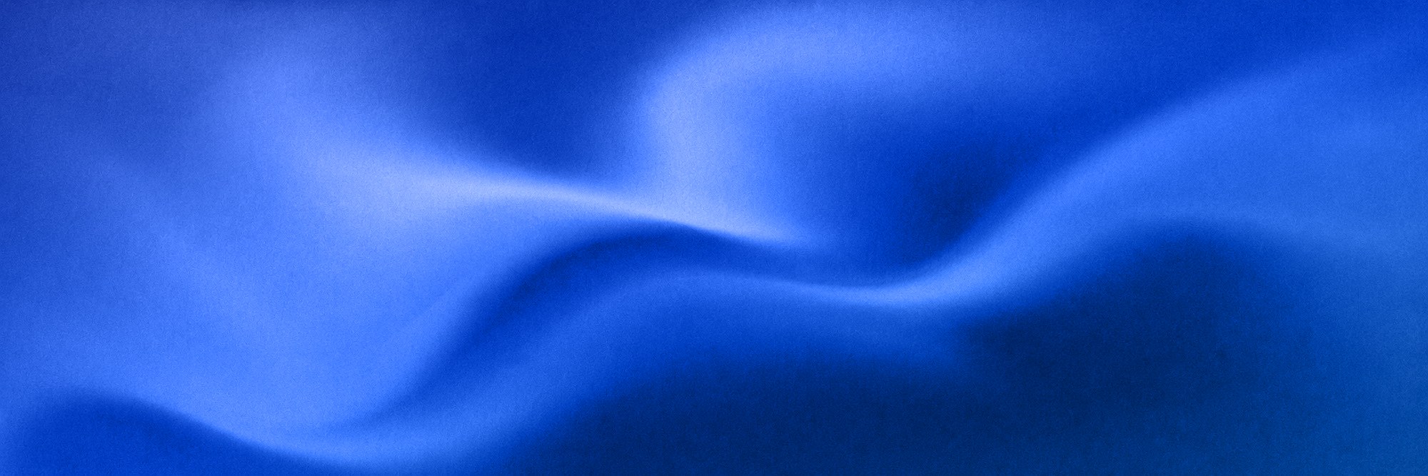
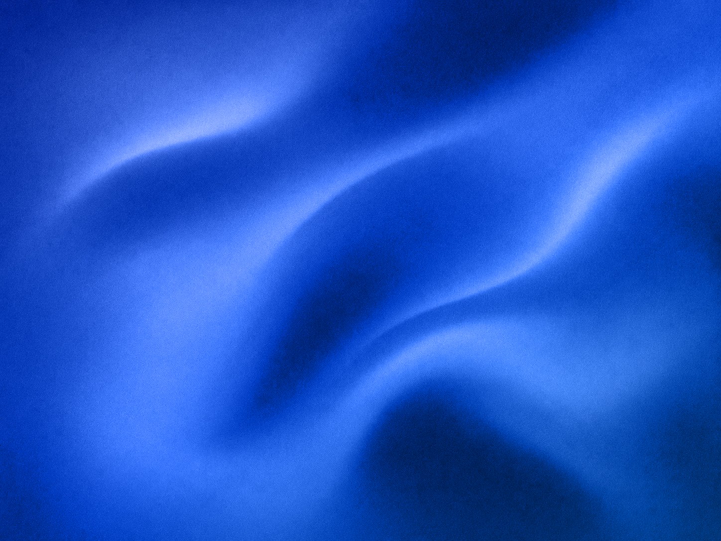
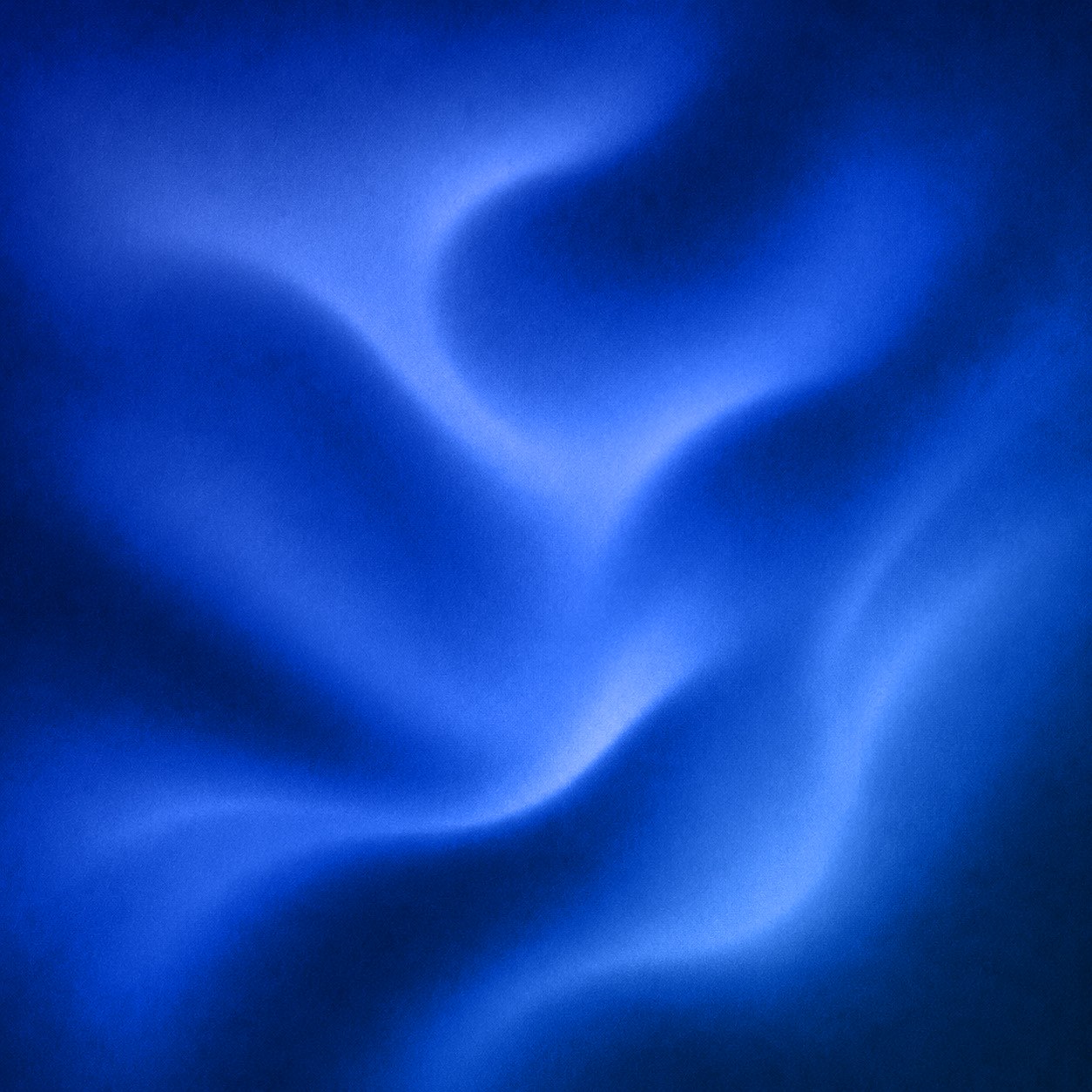
background-image: linear-gradient(135deg, #1e40af, #2563eb 55%, #60a5fa),
                  url('/aurora-wide.jpg');
background-blend-mode: color, normal;
background-size: cover;